
COVID-19 Visualization - TABLEAU
This project illustrates a series of visualization from the well know COVID 19 pandemic that is threatening humanity in this 2020. The visualization was made at Worldwide level with data from the 31st of December 2019 to the 22nd of July 2020 using Tableau. The dataset was collected from Our world in Data.
With the help of Tableau I created the following visualizations:
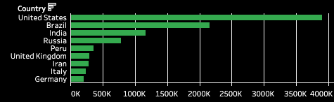
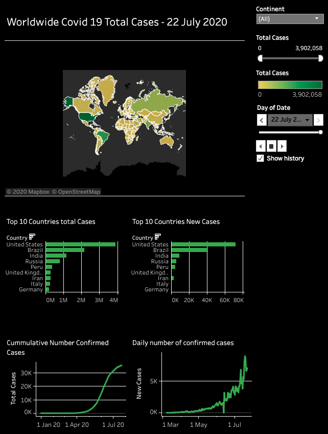
- Top 10 Countries with the largest amount of total cases to date, where we can clearly see that the United States in the first place double by far the number of Brazil cases, followed by India, Rusia, Peru, UK, Iran, Italy and Germany. From this chart we can see that there are three countries that belong to the American continent, letting us see that the majority of the infected population is on this continent.
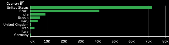
- Top 10 countries with the largest number of new daily cases (22nd of July 2020), where we can see that the countries with the vast majority of the cases are also in this plot with a similar trend to the previous plot.
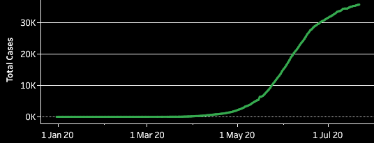
- The cumulative number of confirmed cases, which represent the time series of the worldwide total cases, which we can clearly see shows an exponential growth until the first days of June, and from these days it looks like it is finally reaching a peak in mid-July.
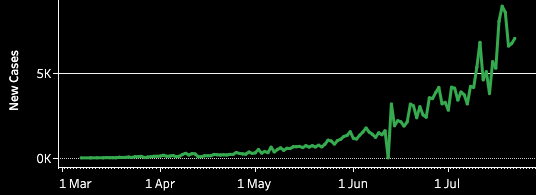
- The daily number of confirmed cases, where we can see the daily new cases fluctuation at a worldwide level.
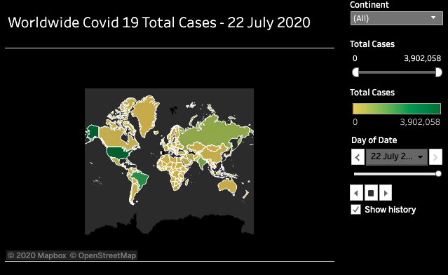
- Total COVID 19 total cases, where we can see the number of cases per country plotted on a map by the 22nd of July 2020. The yellow represents fewer cases that the dark green as in the colour scale in the top right corner of the map.
- With the aid of tableau, I designed a dashboard, where all the visualizations can be gathered together.
Click on the image to see the dashboard in Tableau.
One of the biggest benefits from Tableau is that allows the user to animate the visualizations, hence I created an animated visualization of the previous dashboard, where the date varies from the 31st of December 2019 to the 22nd of July 2020, allowing us to see the COVID 19 behaviour through in a daily basis since the start of it:
The previous visualizations provide us with valuable information, however, it is highly important to visualize the number of cases per million of population, where we will be able to see the real impact of the pandemic per country on a map in the following tableau project:
If you like to see the animation with incremented speed, please see the following video: